ShopDreamUp AI ArtDreamUp
Deviation Actions


Description
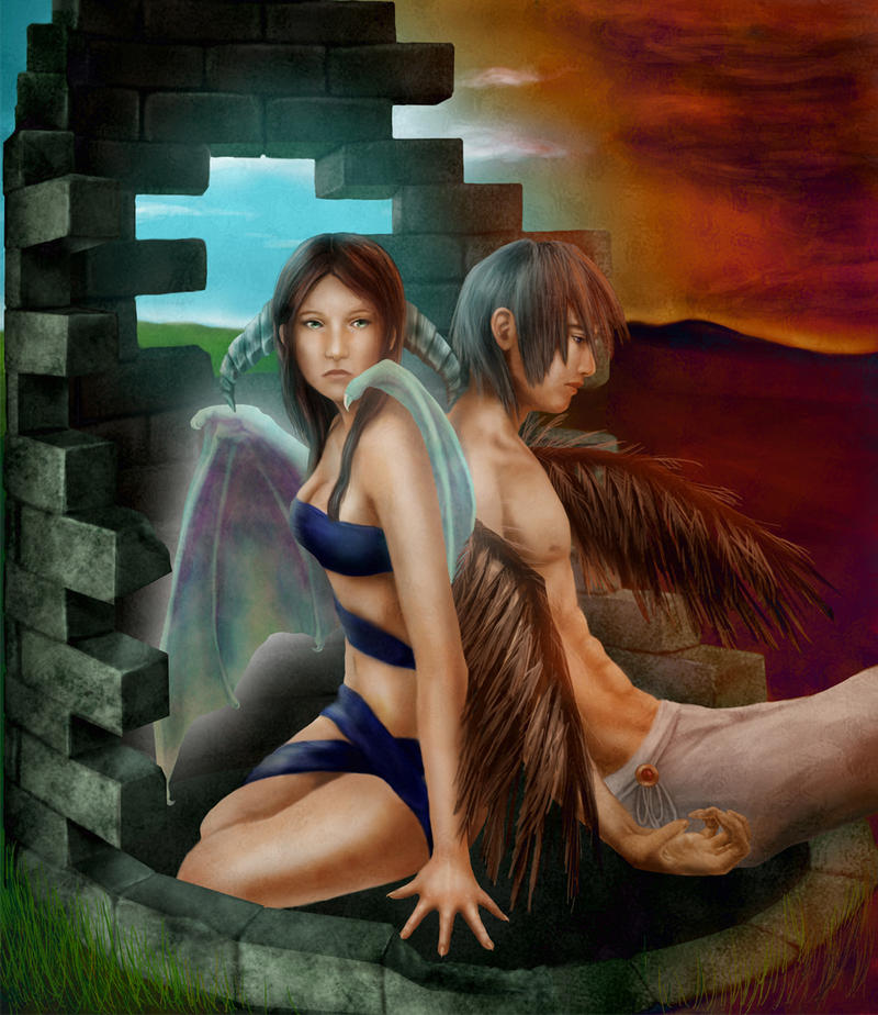
It would be an understatement to say this was a work of obsession... 
This is my final entry for the Bring Your Vision to Life contest! :3 I worked really hard on it, so please full view!
Meaning:
Demons who walk among the earth are feared by humans. This is why the humans would lock them away in these impenetrable towers of stone.
This demon is not really a demon at all. She cannot help how she was born and what she looks like. Any mistake she makes is construed as evil due to the prejudice already against her from birth. She spends her life in the tower until it inevitably falls apart by itself.
Eventually an angel comes to join her. He has committed horrendous acts which he once fooled himself into believe were for good. His wings have burned and withered and he has nowhere to go. In his immense regret and hurt, he confines himself to the once magnificent tower for the rest of eternity, alongside the demon.
There are two types of good and evil. There are those forged by society, and those created by the decisions we make. Everyone has both good and evil inside of them. To what extent is the question.
There's a coin. It has 'heads' and it has 'tails.' But in the end it's still just a coin.
Please support my entry by commenting and ing!
ing!
Photoshop CS3
Wacom Graphire tablet
51 hours
EDIT: As of today, November 21, 2009, this Deviation has reached 50 fav's! Thank you everyone!
This is my final entry for the Bring Your Vision to Life contest! :3 I worked really hard on it, so please full view!
Meaning:
Demons who walk among the earth are feared by humans. This is why the humans would lock them away in these impenetrable towers of stone.
This demon is not really a demon at all. She cannot help how she was born and what she looks like. Any mistake she makes is construed as evil due to the prejudice already against her from birth. She spends her life in the tower until it inevitably falls apart by itself.
Eventually an angel comes to join her. He has committed horrendous acts which he once fooled himself into believe were for good. His wings have burned and withered and he has nowhere to go. In his immense regret and hurt, he confines himself to the once magnificent tower for the rest of eternity, alongside the demon.
There are two types of good and evil. There are those forged by society, and those created by the decisions we make. Everyone has both good and evil inside of them. To what extent is the question.
There's a coin. It has 'heads' and it has 'tails.' But in the end it's still just a coin.
Please support my entry by commenting and
Photoshop CS3
Wacom Graphire tablet
51 hours
EDIT: As of today, November 21, 2009, this Deviation has reached 50 fav's! Thank you everyone!
Image size
975x1125px 833.14 KB
© 2009 - 2024 Kuroikii
Comments49
Join the community to add your comment. Already a deviant? Log In
I love it I like the opposites haven and hell the in between  (Smile)")